
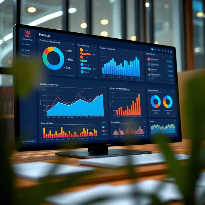
Understanding Adobe Forecast: Insights & Uses
Explore Adobe Forecast 📊, a predictive analytics tool designed to boost business decisions with real-time insights, seamless Adobe integration, and future-ready features.
Edited By
Sophie Clarke
Advanced charts dig deeper than typical graphs to help finance professionals spot patterns and trends often missed in basic visuals. Instead of just showing data points, these charts layer details that reveal relationships, variations, and anomalies critical for smarter trading and investment decisions.
In Indian markets, where data can be vast and volatile, using advanced charts helps analysts make sense of rapid movements on the Sensex or Nifty indices. For example, a Renko chart smooths out price fluctuations to spotlight clearer trends, which is a boon in the choppy stock environment common during election seasons or budget announcements.

Beyond price, advanced charts include elements like volume, moving averages, and momentum indicators all in one view. Candlestick charts, with their coloured "bodies" and shadows, are widely used to read market sentiment instantly. These visuals adapt well for currency pairs in forex or commodity price shifts in gold and crude oil.
Advanced charts convert complex raw data into actionable insight, so understanding their components and interpretation skills is vital for traders and analysts alike.
Key types of advanced charts include:
Renko and Point & Figure charts: Filter out noise to highlight price trends over time.
Heikin-Ashi candles: Show smoothed price movement to reduce random fluctuations.
Volume Profile charts: Display volume traded at specific price levels, useful in identifying strong support/resistance zones.
Heat maps: Represent multiple assets’ performance in a compact and colour-coded format.
Mastering these charts improves decision-making by presenting data clearly and concisely. It also aids in spotting reversal signals or breakout patterns early, ensuring traders can react swiftly in India’s fast-paced markets.
Understanding how advanced charts work—and when to use which type—lets you upgrade your analysis from guesswork to precision. The following sections explain designing and interpreting these charts with examples drawn from real Indian market scenarios.
Advanced charts allow traders, analysts, and investors to interpret complex data sets more effectively. These charts go beyond simple graphs by presenting multiple variables, hierarchical structures, or time-based patterns, helping you spot trends and relationships that basic charts might miss. Choosing the right type of chart can dramatically improve decision-making and forecasting.
Scatter plots with multiple variables show relationships between several data points simultaneously. For instance, an analyst tracking stock performance might use a scatter plot with axes for price-to-earnings ratio and market cap, while bubble size represents trading volume. This reveals clusters or outliers—helping identify undervalued stocks at a glance.
Bubble charts to show volume and categories extend scatter plots by adding a third variable through bubble size and often a fourth through colour. In market research, you could use such a chart to compare consumer segments based on purchase frequency, average spend, and regional distribution, all in one view. This compact visual aids strategy planning by highlighting key customer groups.
Parallel coordinate plots handle multiple variables across various dimensions. When analysing mutual fund portfolios, each axis could represent risk, return, expense ratio, and asset class percentage. Investors can then trace lines to see how funds differ across criteria, spotting those that match their risk appetite and investment goals.
Tree maps for nested data visualise hierarchical structures like a company’s revenue broken down by region and product category. Each rectangle’s size reflects revenue share, making it obvious which products or regions dominate. This format is space-efficient for annual reports or strategic reviews.
Sunburst charts for multi-level hierarchies display additional layers beyond tree maps, ideal for visualising organisational structures or website navigation trees. For example, a banking app team may use sunburst charts to track customer journeys from homepage to transaction completion, identifying drop-off points more clearly.
Network diagrams to display relationships map connections between entities, useful for understanding social or supply chain networks. A brokerage firm might use such diagrams to analyse interactions between clients, market makers, and dealers to detect unusual trading patterns or insider connections.
Advanced line charts with confidence intervals provide more insight than simple trendlines. When forecasting commodity prices, the confidence band shows the probable range of future values, helping traders manage risk better by understanding the uncertainty around predictions.
Candlestick charts used in financial data richly convey price action in stock trading. Each candle records open, high, low, and close prices over a time frame, making patterns like engulfing or doji candles visible to signal potential reversals or continuation.
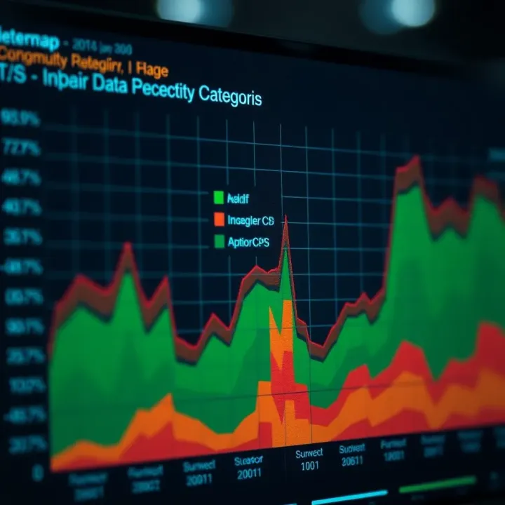
Heatmaps showing temporal patterns reveal intensity or frequency changes over time with colours. An equity research team could track trading volume or volatility by hour and day, capturing patterns like liquidity spikes at market open or close, which inform intraday strategies.
Picking the right advanced chart type depends on your data’s structure and analysis goal. Understanding their use cases makes your insights sharper and presentations more compelling for stakeholders.
Advanced charts rely heavily on well-prepared data and thoughtful design choices. The quality of data and the clarity in chart design directly influence how effectively you can interpret complex information. Before visualising data, it's essential to structure it properly and select variables and scales that reflect real-world context accurately.
Cleaning and organising raw data is the first critical step. Raw data often has inconsistencies, missing values, or errors, which can mislead your visual interpretation if not addressed. For example, a trader analysing stock prices over months must ensure that dates are consistent and no duplicate records affect trend lines. Cleaning data involves removing outliers where necessary and filling gaps logically to maintain continuity.
Choosing appropriate variables and scales means selecting those factors that truly represent the data story you want to communicate. In financial charts, the decision between using nominal prices or percentage changes matters. Also, selecting linear or logarithmic scales can change how trends appear. For instance, during volatile market phases, logarithmic scaling helps uncover relative changes better than linear scales. Wrong variable or scale choices risk confusing analysts or downplaying important patterns.
Proper axis labelling and scaling help the viewer grasp what is being measured and over which range. Clear labels with units, like ₹ (rupees) or percentage change, avoid ambiguity. Scaling should maintain relationships without distortion; squished scales tend to hide variation and can mislead. Consider candlestick charts in stock trading—if the Y-axis scale is inconsistent with the dataset, it might exaggerate or underplay price movements, affecting decision-making.
Using colours and symbols for categorisation enhances distinguishing between multiple data groups. For instance, in portfolio analysis, green dots might represent rising stocks and red for falling stocks. Contrast and colour-blind safe palettes ensure no critical information is lost to accessibility issues. Symbols like triangles or circles can further differentiate data points, especially when colour alone is insufficient.
Interactive features such as tooltips, zoom, or filtering provide users control to explore data layers. Finance professionals analysing market heatmaps benefit when hovering over sectors reveals detailed figures without cluttering the main chart. Such interactivity transforms static charts into decision-making tools, allowing deeper insights from complex datasets.
Clean data and clear design reduce cognitive load, making advanced charts more effective for traders and analysts working with intricate financial information.
These components together build advanced charts that don't just look appealing but genuinely aid interpretation, helping professionals make informed decisions with confidence.
Building and interpreting advanced charts is integral to transforming complex raw data into clear, actionable insights. For traders and analysts, the ability to select the right chart type, construct it accurately, and interpret its patterns correctly can mean the difference between spotting a market opportunity or missing it altogether.
Matching data characteristics with chart formats requires understanding the nature of your data—whether it is categorical, continuous, time-series, or hierarchical—and then choosing a chart type that effectively represents these characteristics. For example, candlestick charts excel in showing price movements over time for securities, while parallel coordinate plots help visualise multiple variables simultaneously to detect relationships or clusters.
Tailoring charts to data also reduces noise and enhances clarity. Traders analysing sector performance may find heatmaps useful for indicating intensity or change, while network diagrams better illustrate relationships between entities, such as trading partners or supply chain links.
Avoiding common pitfalls in chart selection is equally important. A common mistake is trying to fit data into a trendy chart, which can obscure key patterns or mislead viewers. For instance, using 3D charts might look impressive but often distort data proportions, making it harder to interpret.
Similarly, selecting charts without considering the audience’s familiarity can hamper understanding. For example, crowding a presentation with complex bubble charts might confuse clients who expect simpler visuals such as line charts or bar graphs. Always ensure the chart type aligns with both the data and the viewer’s expectations.
Tools and software suited for advanced charting include platforms like Microsoft Power BI, Tableau, and Python libraries such as Matplotlib or Seaborn. These allow integration with various data sources and offer versatile chart templates—from multivariate scatter plots to hierarchical tree maps. Selecting the right tool depends on the data’s complexity and the need for interactivity.
Importing and linking data sources is a critical step. In practice, you might connect Excel sheets with historical stock prices, database exports of financial KPIs, or live market feeds. Proper linkage ensures real-time updates and consistency. For instance, traders using NSE India historical data can benefit from automated data refresh to reflect the latest market conditions.
Customising chart elements for better communication enhances reader comprehension. This includes adjusting axis labels to reflect units in ₹ lakhs or crores, using colour schemes consistent with brand guidelines or accessible to colour-blind viewers, and incorporating interactive filters enabling users to zoom in on specific time periods or sectors.
Spotting trends, clusters, and outliers helps identify meaningful market behaviours. A clear upward trend in a line chart might indicate a sustained bull run, while clusters observed in a scatter plot could reveal segments of high-performing stocks belonging to a particular sector. Outliers, such as sudden spikes or drops, warrant deeper investigation to rule out errors or highlight exceptional events.
Understanding correlation versus causation is crucial to avoid misleading conclusions. For example, an increase in crude oil prices might correlate with rising inflation indices, but one should not immediately assume causation without considering other factors like currency fluctuations or geopolitical events.
Always question if observed patterns genuinely reflect underlying market causes or just coincide by chance.
Highlighting key insights clearly ensures that the main findings stand out. Use annotations, callouts, or contrasting colours to draw attention to critical data points—say, signalling when a moving average crossover indicates a potential buy or sell signal. This practise helps brokers and investors make informed decisions quickly without sifting through clutter.
In short, building and interpreting advanced charts involves thoughtful selection, precise construction, and sharp analysis. Done right, they become powerful tools turning raw figures into strategic foresight in trading and financial decision-making.
Advanced charts play a significant role in business and research by transforming raw data into actionable insights. When used wisely, they enable professionals to spot trends, assess risks, and make data-driven decisions faster. This section explores how these advanced visual tools function in specific domains like financial markets, market research, and academic presentations.
Candlestick charts and heatmaps have become vital tools in trading analysis. Candlestick charts show the open, high, low, and close prices of stocks or commodities, allowing traders to interpret market sentiment quickly. For instance, in Indian stock exchanges like NSE and BSE, candlestick patterns help investors detect bullish or bearish trends, supporting timely buy or sell decisions.
Heatmaps complement candlestick charts by visualising vast amounts of market data, such as sector-wise stock performance or intra-day price changes. A heatmap’s colour gradients highlight areas of strength or weakness, making it easier to focus on critical sectors like IT or FMCG during volatile periods.
Tracking inflation and employment trends is equally important for policymakers and economists. Advanced charts can display time-series data of consumer price index (CPI) and unemployment rates with clear visual cues, helping analysts to discern cycles and anomalies. For example, line charts enhanced with confidence intervals offer clarity on recent inflation volatility in India, while heatmaps can illustrate regional employment disparities across states.
Cluster plots offer clear segmentation of customers based on variables such as purchase frequency, income level, and product preferences. This method helps Indian businesses customise marketing strategies effectively for tiers 2 and 3 cities where consumer patterns differ widely from metros. For example, a cluster plot might reveal distinct groups in Bengaluru's tech-savvy population versus more traditional buyers in Mysuru.
Visualising product preferences over regions is crucial for inventory and sales planning. Advanced maps combined with bar charts or heatmaps can exhibit how jewellery or textile sales vary across Maharashtra districts during festive seasons. This geographic insight helps brands align stock levels and promotional offers based on region-specific demand spikes.
Complex relationships in research papers often involve multiple variables interacting in subtle ways. Advanced charts like parallel coordinate plots or network diagrams offer a powerful way to illustrate these connections. For instance, a study on crop yield determinants in different Indian agroclimatic zones could use these charts to show the interplay between soil quality, rainfall, and fertiliser use.
Interactive chart features greatly enhance academic presentations by allowing audiences to explore data dynamically. Researchers presenting at conferences or seminars in India can use tools like Tableau or Power BI to zoom into specific data points or filter variables on the spot. This interactivity fosters better engagement and clearer understanding, especially in multidisciplinary research involving economics, sociology, or environmental studies.
Using the right advanced charts tailored to the audience and purpose converts complex datasets into straightforward stories, enabling better decisions whether in trading, marketing, or research.
In all, advanced charts equip professionals with sharper lenses to interpret data, spot patterns, and communicate insights clearly across India’s diverse business and academic environments.
Advanced charts are only as good as the accuracy and clarity they maintain. Applying best practices ensures that the data story is reliable and understandable. For traders and analysts, misleading visuals could lead to wrong decisions, so precision matters here.
Distorted scales can exaggerate or downplay trends in stock prices or market indicators. For example, using inconsistent intervals on the y-axis in a candlestick chart can make a small drop look catastrophic or a big rise seem modest. Likewise, cherry-picking data — showing only favourable time periods — biases interpretation. Avoiding such manipulation maintains credibility and supports sound analysis.
Bias in data source is another critical concern. Suppose you use economic indicators that are outdated or from sources with political leanings; your chart could misrepresent market realities. Transparency about where data comes from helps users trust the analysis. Traders relying on real-time data feeds from trusted platforms like NSE or BSE expect current, unbiased information.
Clear legends and explanatory notes guide viewers through complex charts. A bubble chart showing sector-wise investment volumes might confuse without a legend explaining bubble sizes and colours. For busy professionals, well-labelled components save time and enhance comprehension.
Colour choice also impacts accessibility. Around 8% of men have some form of colour-blindness, so using palettes that avoid problematic colour combinations (like red-green) ensures charts are readable for all. Tools like ColorBrewer provide tested palettes suited for accessibility.
Technical traders and retail investors have different appetites for detail. The former may want raw volume numbers, moving averages, and volatility indexes. Retail investors often prefer simplified, intuitive visuals highlighting key trends. Tailoring charts to audience needs avoids information overload and keeps the message effective.
Interactive dashboards support ongoing monitoring by allowing users to customise views and update data continuously. For instance, a financial analyst tracking inflation trends can filter timelines or adjust parameters to spot fresh patterns without requesting a new report. This flexibility aligns with dynamic market environments.
Accurate, accessible, and audience-tailored charts turn complex data into actionable insights — a must for Indian finance professionals navigating volatile markets.
Always check scales and data completeness to avoid distortions.
Cite trustworthy, current sources to maintain transparency.
Use clear legends and accessible colours to promote understanding.
Adjust complexity and interactivity based on who’s viewing the chart.
Applying these best practices helps charts stay honest and user-friendly while offering the depth traders and analysts need for smart decision-making.
Explore Adobe Forecast 📊, a predictive analytics tool designed to boost business decisions with real-time insights, seamless Adobe integration, and future-ready features.
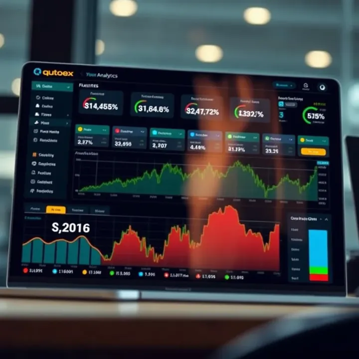
Explore Qutoex thoroughly! Learn how it works, its key features, tips, and safety aspects for beginners and experts alike. 📊💡
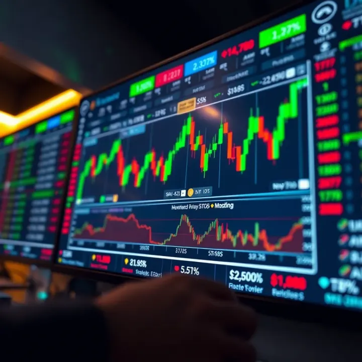
Explore Delta Exchange for crypto derivatives in India 🇮🇳. Learn trading options, safety tips, rules, and how it compares to other platforms for Indian investors 💹.
Explore BSNL stock's market trends, investment factors, and future outlook 📈. Understand how India's telecom sector impacts this state-owned giant's value.
Based on 6 reviews